Compilation and study of Non-PhotoRealistic (NPR) techniques in Blender
The following document studies some of the graphical styles of Non-Photorealistic Rendering (NPR for short) possible to do with Blender Internal old rendering engine (BI) and Cycles, the capacity of these techniques to migrate from one renderer to another, in particular from BI to Cycles, their limitations, analysis and also some proposals.
Here you can download the files.
About this document
TL;DR of section: Current state of NPR in Blender and alternatives under my point of view and why I wrote this.
The creation of this document has 2 main reasons: the first one as a record of the many different tools for NPR that I have seen along the years as a Blender user (in other word as a remainder); and the second one because of a personal need to keep myself and the techniques I like using up to date, since as 1st November 2017 the date of the release of Blender 2.80 approaches and with it the end of BI.
As melodramatic as that may have sound, many users (me included) have been complaining about this and many ideas about what to do about it have been repeatedly popping up:
Complete or partial freeze of personal work-pipelines: In other words, keep using Blender 2.79 indefinitely, either as main tool or as a composition tool. As a personal opinion, it is possible but it also is a worst case scenario, because as time passes the incompatibility and the probability of newer and better tools breaking the pipeline increases.
Development of New Renderer: Expensive scenario no matter how is this done (external software, add-on, somehow make it into Blender), and fail prone if developer is an outsider of the Blender Foundation, mostly because of possible changes in data management within Blender (Blender DNA and RNA, not an expert but these seem to be compatibility breakers?). Not much, if any, interest from Blender development team.
Real-Time Shaders: At the moment, Blender uses OpenGL for the viewer and is mostly compatible with BI, but what happens with and after Blender 2.80 is, at the present, a bit of a mystery, especially with the ongoing work with Eevee and its focus on Photorealism (PR for short). Never been a friend of this approach, especially because of the alpha (transparency) issues that the real-time viewer has. There is a lot of speculation and no definitive standing on this one. Blender development team is focusing in getting Eevee and Blender 2.80 to work at the moment.
NPR from within Cycles: Maybe the most cost effective and future proof solution, at least in my opinion. As I will be exploring with this document, there are many tools and pipelines that are portable from the old renderer to the newer one, with varying levels of difficulty, limitations and issues of course, but also with newer possibilities and newer graphical possibilities. My guess is that by studying these, a proposal that can focus on whatever feels missing can be made or get accepted with higher probabilities if it isn’t too hard to implement.
Before continuing, I also have the need to mention another important point for this document: as graphically different NPR can look/be from PR, another objective I have to work NPR from within Cycles is the same as why I did it in BI: to be able to have in the same scene both realism and non-realism together (think in “Roger Rabbit”), there are some approaches that I tend to avoid (I will also talk about them though) because they imply changing scene/frame settings that makes me choose either PR or NPR.
Techniques and shader collection
.
Glossary
- Shading techniques
- Mapping
- Composition and environment
- Line art
- Conclusion and Proposals
1.-Shading techniques
Blender Internal
BI has several ways to make cell shading that can both look identical but also have their respective differences.
In this point I’m focusing on object surface color, materials, shaders and material nodes:
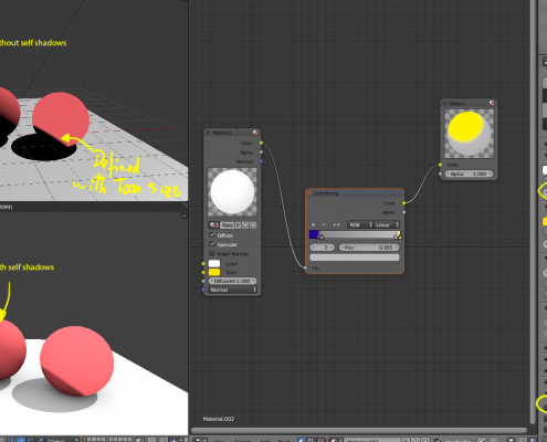
1.- Using default Toon Shader. Can be used with Difuse and Specular or combine it with other shaders, it still has some “realistic” behavior. Interesting fact: Toon shaders gives the possibility to move around the edge of the shading of an object beyond the 90 degrees angle between light ray and the object surface, but this would usually be hidden if it cast shadows.
2.- Using default shaders (Lambert, Toon, etc) with color Ramps. Ramps do override textures though; I don’t particularly like these because of that.
3.- Using nodes to tweak the previous ones. More artistic liberty can be achieved while still interacting with the scene.
4.- Using nodes to do everything. Here we ditch everything (even set materials to “shadeless”) and our materials can be completely unrelated to whatever happens around the shaded object.
5.- Special/other cases. Not strictly needed/related to NPR but there are some interesting node setups, and special cases like Xtoon shader (only simulated in Blender).
Cycles in the other hand has the following:
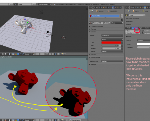
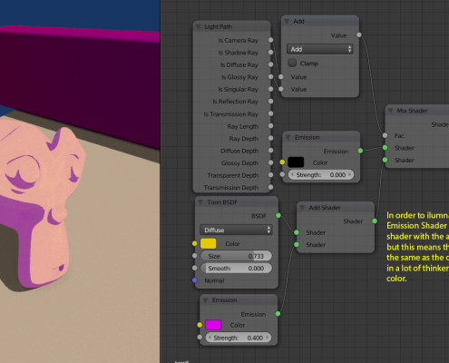
1.- Toon BSDF. Equivalent to changing Lambert to Toon shader in BI, but the interaction with light bounces puts it in a weird realistic-non-realistic imagery; most tutorials use it in conjunction with making several changes into the scene and Cycles parameters. Not a good replacement but brings new stuff into the table on itself.
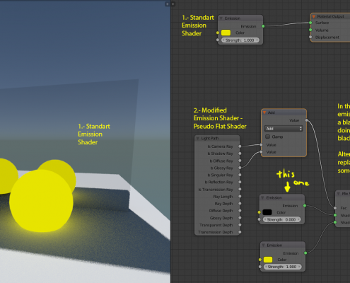
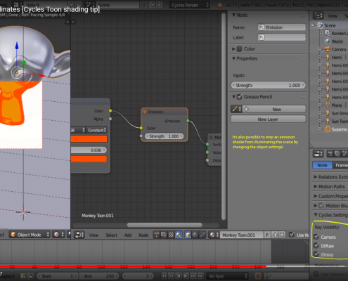
2.- Emission. Closest to “shadeless”, but it emits light. This makes sense realistically but we usually do not want our characters to be light emitting beings. Some tweaks can be done to get desired result, but color accuracy may be an issue as reviewed in this video by Andrew Price approximately from minute 22:57.
I’ll use this shader a lot as a base for the following though.
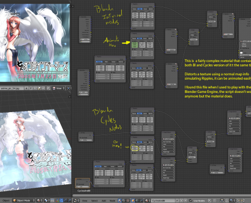
3.- Cycles Nodes. This is the way to go; in fact there isn’t a way around it as far as I know. At the moment I have managed to find ways to simulate some styles I have done before with BI, but the problem are the added complexities and not being able to manipulate shadows and Ambient Occlusion (AO).
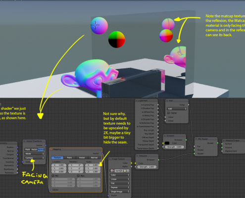
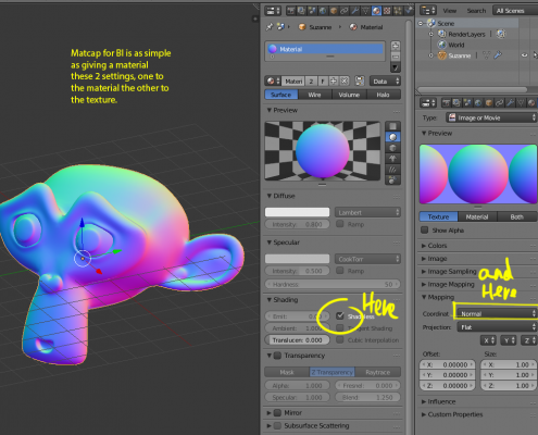
a.- Matcaps: Texture Matcaps in BI are as simple adding the texture and setting the Mapping to “Normal”, but in cycles involves the following:
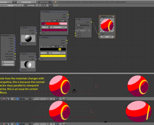
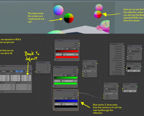
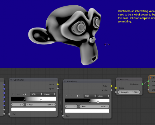
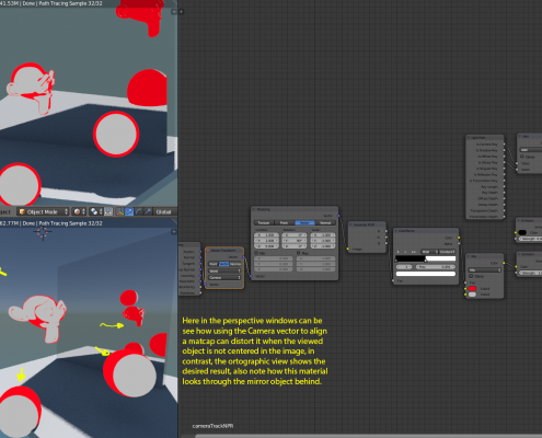
b.- Using normals as a way to make fake matcap: As seen in the point 4 of Blender Internal, it was relatively simple to use ColorRamps and normal to fake shading that works fixed to the camera in similar way to a Matcap. In Cycles these is done by using Mapping nodes and then separate the Vectors in RGB
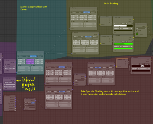
c.- Faking light sources: We can drive further the previous example by fixing the Normals back the world coordinates by deleting 1 node, and by giving drivers to the Master Mapping node we can control the shading as if it were made by a Sun Lamp in BI.
Easier said than done though, (link to image that is too large to see correctly). After that we can even give to it some fake Specular highlight and use normal maps.
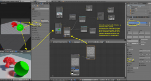
Some shadows can be made but this is more of a hack than a real solution. Besides this solution, nothing else comes to mind to get this material to receive shadows, either self shadows or from other objects.
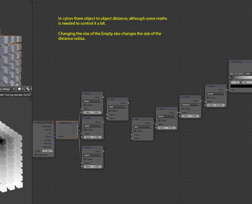
d.- Some special nodes in Cycles to further tests around: Not sure what to do with them yet, but interesting nevertheless.
2.- Texture and UV Mapping
Both for texture mapping on model and for composition (or full screen textures), these can be used to add or achieve extra effects like screen tones or hatching. Here I will focus in objects surfaces and in the final image composition.
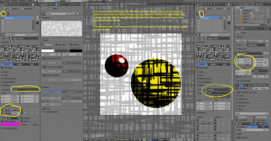
1.- Model mapping with shaders: Texture and UV Mapping is more used to give color texture in flat shaders or to simplify work using only large material instead of many smaller ones. Besides that, there are still some other uses for shading, like in the case of hatching. For hatching, I found 3 ways to do it:
a.- Applying hatching in Color channel: It doesn’t feel as satisfactory for some reason, but works.
b.- Applying hatching with the Normal Channel: It has a more natural flow to the lighting. But can produce some midtones (greys) depending on how it is used black and white normal and color normal maps give different results too. In both this and the previous one point, a good use of UV mapping is indispensable to get a good look, for example these spheres and Suzane look pretty good, but in previous example the UV mapping kind of …no.
c.- Screen space texturing: Rather rare and more commonly done in composition than with material and textures, it’s also more commonly associated with dot Screentones than with hatching, for better look it can be combined with the node work shown up here in point (a.).
2.- Composite mapping: Particularly good with Screentones too, but it isn’t too bad with hatches either. I find a bit glitchy how it works the tiling when using images smaller than render size, reopening the file solves the issue though. There are other ways to do this too.
3.-Composition Nodes
Here I will focus mostly in the final image composition.
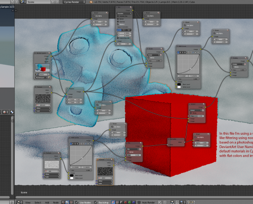
There are a lot of tricks and special effects that can be done in outside of the viewport, but in my opinion it’s not an ideal workflow because of the lack of previsualization, like in the case of hatching compositing up here, the final result cannot be seen until after hitting the render button. But it’s a matter of preference. Here in this image is something similar towhat was mentioned in the Making of Cinderella the Cat.
Tools commonly used here are: separating scene in Renderlayers with extra channels enabled, using Objects Indexes, ColorRamps of course…
There are many effects that do go here that I’m putting in the next section so I can order these methods according to desired output; this document is a Work-in-Progress at the moment so this may still change.
4.-Line Art
Here I will deal with other methods for making line rendering without Freestyle, mostly because it’s possible and more alternatives are better.
All methods have their shortcomings, in fact the best thing to do is combine them depending on what you want.
Methods:
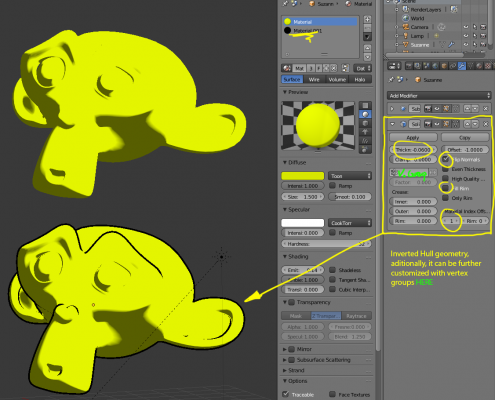
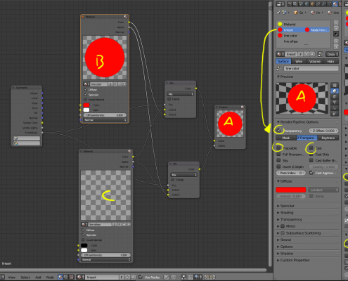
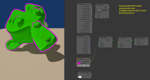
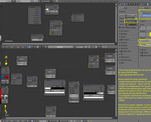
1.- Inverted Hull Method: The concept is simple, we surround or 3D model with a Solidify Modifier setted up with inverted normal and add some special materials that hides the faces in front of the model and shows the ones behind it (remember to active Back face culling in viewport). Good for contour and silhouettes, bad for self-intersection and angular creases. Depending on 3D model it may simple or complex to work with. First in Blender Internal:
Then In Cylces:
2.- Matcap or Fresnel/LayerWeight Method: Also fairly simple, it can be used as a complement to the previous one, the idea is that we make a material that draws the lineart in the normal of the 3D model that are close to 90 degrees respect the camera. Somewhat good for contour and silhouettes, bad for self-intersection and angular creases. I find lineart made this way looks a tad weird.
3.- AO Method (mostly a fix/addition for other methods): Something I thought, in cases of self-intersection or adjacency, a high contrast AO with short distance can be used for this complicated scenario, this works best with BI AO, but realtime AO (called SSAO) makes too many artifacts in short distances (besides cannot be used in render). In Cycles this could be done only in post production/Composite Nodes.
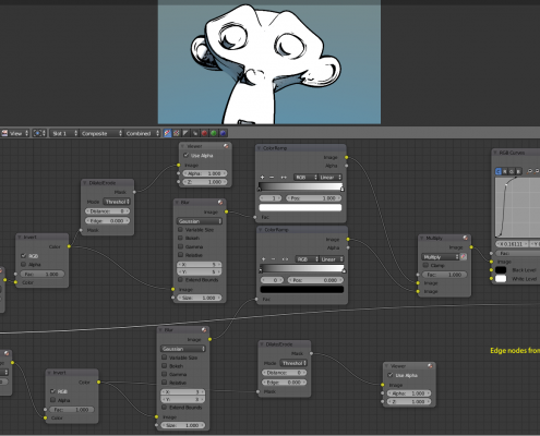
4.- Composite Nodes Method: There are many examples, a famous one is the Edge Nodes 1.2.4, among others, sadly it can be noisy and it does have a slight difference in performance between Blender versions 2.6x and 2.7x. It can detect most kind of edges depending on implementation but is prone to noise artifacts and alias, if done improperly.
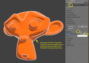
5.- Old Edge in BI: Mentioning it here, but this is one of those obsolete tools that some Blender developers wanted to get rid from long ago; for some really simple stuff gets the work done but makes wireframe artifacts.
5.-Conclution and Proposals
-Work in progress-


